David Kingman recommends a pair of charts which throw some of the UK’s intergenerational inequalities into sharp relief
Intergenerational inequalities can sometimes be a bit too abstract for people to relate to easily. That is why charts and other data visualisations that tell a story are useful, because they can make it much easier for people who aren’t ordinarily familiar with statistics to understand the major social and economic trends that are affecting their lives.
Recently, the Office for National Statistics (ONS) produced a pair of charts which are particularly handy for explaining some of these trends in ways which people will find easy to understand. They involve two of the most totemic intergenerational issues, employment and housing, and they help to explain the widening gap that has been opening up over recent years between the generations.
Earnings gap
The first chart comes from a recent ONS publication called Nowcasting household income in the UK, which attempts to estimate the household incomes of different groups within the UK to look at inequalities between them.
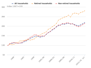
Figure 2 in the link above (“Growth of median equivalised household disposable income by household type, 1977 to 2015/16”), reproduced here, compares changes in household incomes for both working-age and retired households from 1977 to the present. It highlights a dramatic trend: the median retired household now has an income that is nearly three times as much as it was back then, whereas the median working-age household is earning only just over two times as much (this comparison is in constant prices, and uses equivalised disposable income – a way of measuring income which looks at how much households containing different numbers of people would need to earn in order to enjoy the same standard of living).
The chart emphasises that this trend has accelerated since the Great Recession that began in 2008. It shows that, although retired households’ incomes did fall during 2008/09, they recovered remarkably quickly, and are now significantly higher than they were the year before the Great Recession began. By contrast, working-age households have only just seen their incomes regain the level they were at the year before the Great Recession began, following a much steeper and longer decline.
Of course, this comparison only looks at relative levels of income; in absolute terms, the median working-age household still earns significantly more than the median retired household, although the gap between them has narrowed because of these trends. While the rising income levels enjoyed by pensioners do represent progress, they have come about in part because of a) the political decision to protect public spending on pensioners, including the most well-off among them, while spending on benefits and services predominantly used by working-age households have been falling, and b) the maturation of private sector defined benefit pension schemes, which may be having a detrimental impact on firms’ ability to invest in technology and higher pay for their current staff.
“…no sign of abating”
The second chart is a simple one: it just shows how average UK house prices have grown over the past 10 years (Figure 1 on the linked page, reproduced here).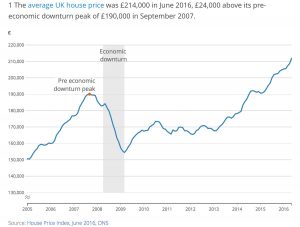
It demonstrates that average house prices, unlike working-age incomes, have surged upwards since enduring a brief fall during the Great Recession: the average price is now £24,000 above its pre-economic downturn peak of £190,000 in September 2007.
If you scroll down that page, the next chart shows the dramatic effect which this has had on young people’s ability to get on the property ladder. The percentage of 25–29 year-olds owning their home decreased from 55% in 1996 to 29% in 2015, while the percentage of 30–34 year-olds owning their home decreased from 68% to 45%. In the introduction to these data, the ONS makes a matter-of-fact statement which will strike a chilling note for many young people: “the steady rise in the cost of buying a home shows no sign of abating.”
The phenomena which these two charts describe are linked in several ways. Firstly, they indicate that housing costs are growing much more rapidly than workers’ incomes. That implies that many working-age people – especially those in their 20s and 30s – are likely to suffer a gradual deterioration in their living standards, as housing takes an ever-increasing share of their money.
Secondly, they demonstrate how well the growing number of retired people who are fortunate enough to own their own homes have done over recent years, especially since the Great Recession. While obviously not all retired households own their own homes – and there remains a large number of poorer retired people towards the bottom end of the income distribution who are struggling – these charts demonstrate that the fortunes of property-owning older people and young workers are continuing to move sharply in opposite directions.