David Kingman explains new figures from the ONS which suggest people are already living longer than previously estimated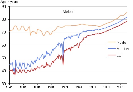
How long can someone reading this article expect to live? Obviously, we don’t know – although we can make an estimate, based on how many years people living in similar circumstances tend to last.
We do know that how long someone is likely to live is affected by their age, most importantly, as well as a range of other factors; their gender, where they live, their ethnicity, their educational qualifications, what kind of work they’ve done for a living, and their lifestyle habits will all play a role.
The more an estimate takes account of someone’s individual circumstances, the more accurate it is likely to be. But what about the kind of life expectancy estimates which cover the whole population, and are used to inform government policy?
At this level, there is likely to be a high margin of inaccuracy, because the data has to take account of so many sets of different peoples’ individual circumstances – and a recent set of figures show just how much this is influenced by the way the data is calculated…
Mean and Mode
Everyone knows that life expectancy has been rising consistently in Britain for over the last hundred years. In 2010, a girl born in England and Wales could expect to live to 83, while men were slightly behind them at 79.
However, these numbers may not be entirely reliable – new data from the ONS also shows that in 2010, the most common age at which women died was 89, while for men it was 85; a difference of 6 years for both genders. So, why is there this difference?
The difference can be explained by the distinction between calculating a mean and calculating a mode. When people talk about “life expectancy,” usually they are referring to the most common way of measuring it, which is the number of years someone can expect to live from the moment they are born. This is often calculated by averaging the ages at which everyone whose death was registered in the country during that year died.
This is one way of measuring life expectancy, but the problem with it is that the final result tends to be distorted by the relatively small number of deaths which occur among people who are much younger than average, as these pull the central tendency of the data set towards its more extreme values.
This is still useful in itself for measuring the average longevity of the entire nation, but when a country has reached a situation, as the UK has, where youthful mortality has been significantly curtailed compared to historic averages, and most of the increases in life expectancy are occurring among the older population, a method of calculating life expectancy which gives disproportionate weight to the minority of people who die at younger ages becomes a less useful tool.
As the ONS puts it in its report:
“Life span is usually measured by life expectancy at birth, which is highly influenced by deaths at young ages, so recently ONS has been investigating other measures of average life span. For example, the late modal age at death is solely influenced by adult mortality and consequently much more sensitive to improvements in mortality among the older population.”
The reason why the second set of figures given above shows life expectancy to be 6 years higher, on average, for men and women than the first set of figures, is because these estimates of life expectancy were created using the mode rather than the mean.
An example
This produces a value based on the most common age among all the deaths registered in England and Wales during a given year. The difference between the two is demonstrated by the following example (on a very small scale):
If you were looking at a country where only 10 people died during a given year, and their respective ages were 4, 5, 15, 65, 85, 88, 89, 89, 90 and 91, then the mean age of death would be 62.1 (all the numbers added together and divided by 10). However, the modal age of death would be 89, as this was the most common age of death during this year.
Using such a small amount of data obviously produces a skewed result, but when these two different methodologies are applied to the data for a big country (as the ONS figures show), then the end results can produce a small but significant difference between the two different answers. Neither method is necessarily superior to the other, although in the case of the example given above, the modal answer appears to be somewhat more representative as an average value for the whole data set than the mean value would be.